Sharing economic freedom data with the world.
The Fraser Institute's (FI) mission is to "improve the quality of life for Canadians, their families, and future generations by studying, measuring, and broadly communicating the effects of government policies, entrepreneurship, and choice on their well-being."
From the fall of 2016 until early 2017, I led the redesign of The Fraser Institute's "Economic Freedom" site from concept to completion. Throughout the project, I created all concepts and designs, presented deliverables, provided UX/UI consultation, conducted discovery exercises, and worked closely with the team during the development process.
ImageX
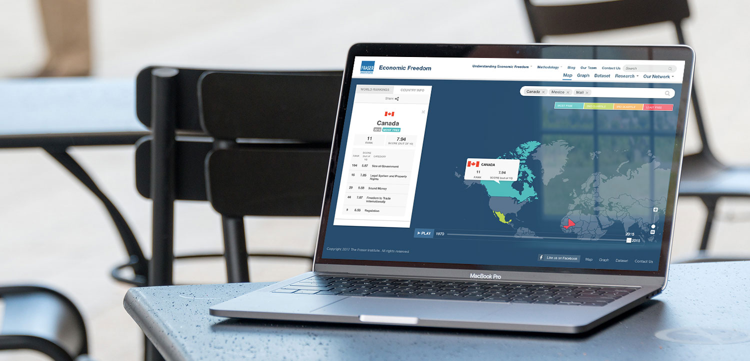
We were tasked with redesigning FI's Economic Freedom site, in order to make it more visually-engaging and easy to navigate for users, while keeping the current brand found on the FI main webpage. Originally, the Economic Freedom site was all static text pages and PDF resources for graphs and heat maps — no interactivity at all. In fact, it was very difficult to view any information at all without having to dig through PDF docs or lines in an excel spreadsheet.
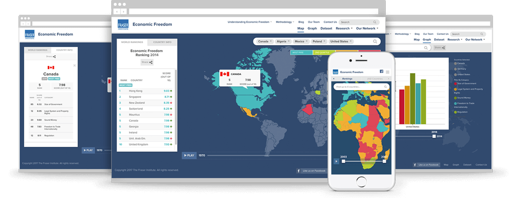
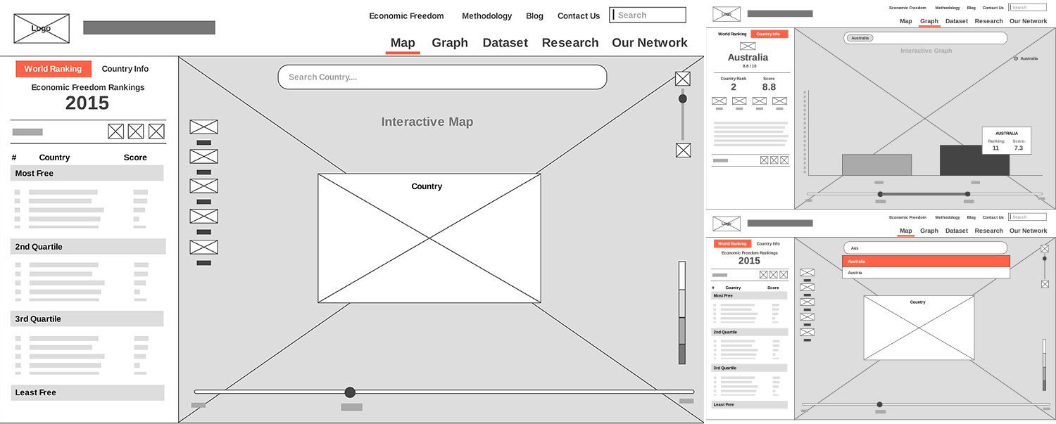
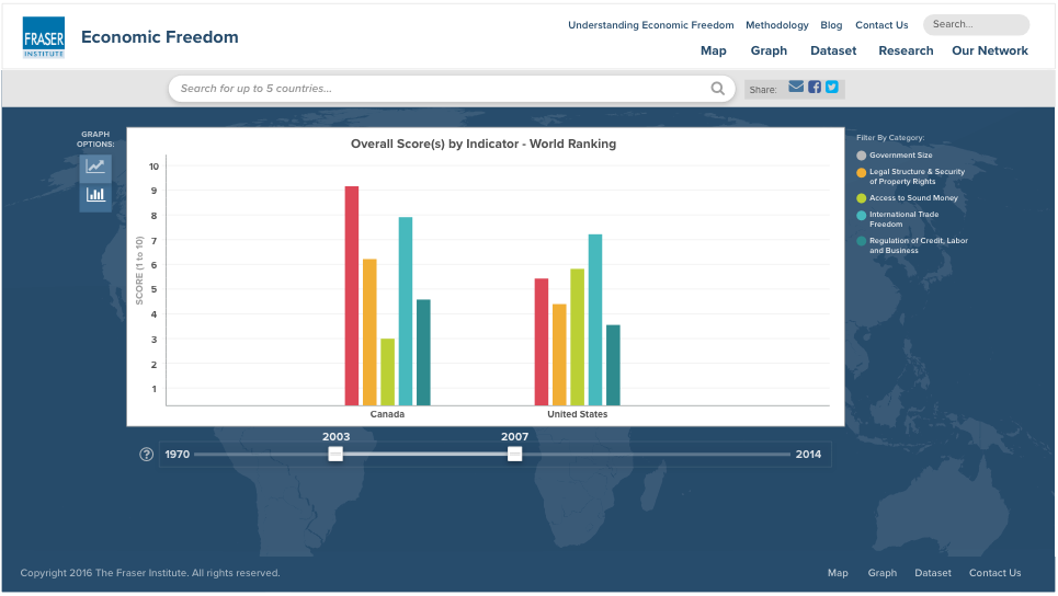
Our approach was to pull FI's data out of a standard table view and allow the user to interact with it through maps and graphs with a variety of filters.
We conducted a two-day workshop exercise with the client in order to identify and elaborate on key details for the project, such as feature priority, user personas, user journeys, pain points of the old site, content management and more. During these workshops, we worked closely with the client asking questions and getting them involved in the discovery through sketching and sticky note exercises.
After our discovery workshop, user interviews and research, we felt we had a strong grasp on what we needed to design in order to achieve success. Our objective was to create a fully-responsive, interactive site that allowed users the ability to customize the data they want to see. It was important to be able to carry through their chosen filters of specific countries and categories across different visualizations and the data table download page. Now, individuals can discover what data is important and download that specific data set — without the need for additional filtering.
We collected inspiration from competitor sites and other map/graph examples by documenting the best ideas and removing those that weren't applicable to the Economic Freedom site. For example, one competitor site (Heritage.org) had a similar concept of an interactive map and graph for their data. However, after extensive testing, there were easily-identifiable areas where the UI could be improved. For example, navigation for the data visualizations were frequently found underneath graphs/maps, which made it difficult customize the map without having to scroll often. Maps also had no separation between the interactive area on the white HTML page background — leading several users to zoom into a map when they are actually trying to scroll down the page itself. A key observation on competitor sites was that not one of them was responsive, which rendered the experience unusable on mobile and tablet devices.
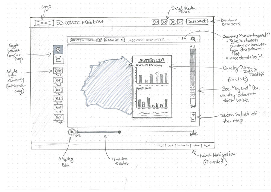
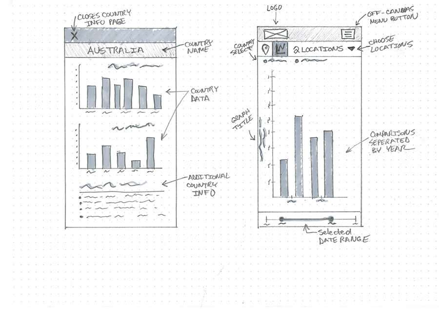
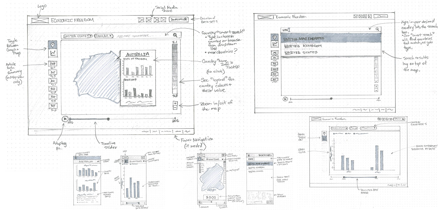
Once the sketches were approved, my team created some "proof of concept" interactive prototypes using an online software. We used these prototypes to test the overall experience flow with the internal team, the client and real users. This exercise helped both the client and our team understand how everything was going to work together and identify any sticking points in the user experience. It was also helpful in getting meaningful feedback from users on whether their needs were being met with our design. Originally, our map was contained within a max-width box on the page, but after user feedback, we updated the design to be a full-screen map. This change stemmed from several users' requests to make the experience feel more immersive. As it turns out, many users wanted to replicate a familiar experience to Google Maps, which they used frequently.
There were significant improvements in daily pageviews, the bounce rate and time spent on individual pages, all of which exceeded our initial goals. Within three months of the site launch, the Fraser Institute was flooded with feedback from their site users around the globe to give them praise for the new site experience.
“This is great and it will help me as a teaching aid in my economic freedom courses.” - Professor B.D., Poland
“This is so much better. Excellent job. I especially like the built-in timeline.” - J.K., Bosnia
“The interactive world map with customized graphing and data downloads will make it significantly easier for people to analyze and share economic freedom data, and it works on smartphone, tablet or desktop computer.” - L.W., Canada